my latest obsession
color as atmosphere
Lately, I’ve been drawn to spaces where color isn’t just a finishing touch — it’s the whole point.
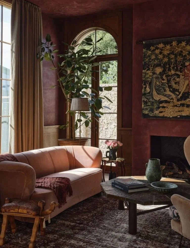
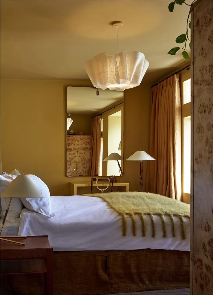
I know color-drenched rooms can come off as trendy, but there’s something undeniably right about being fully immersed in a single, intentional hue. Not bold pops or sharp contrast — just tone-on-tone harmony that lets the color take the lead. In these spaces, color becomes more than a design decision. It becomes the atmosphere. One well-chosen hue, thoughtfully layered, often does more than a dozen competing ones ever could.
There’s something calming about color when it’s allowed to take over with no interruptions — walls, cabinetry, ceiling, trim, even upholstery and decor. It’s like stepping into a single, continuous thought. That’s what I love most — the emotional microclimate you create and the mood you set when you commit to one color. It’s no longer a palette, it’s the pulse of the room. You walk in, and before your mind has time to register anything, your body already knows: this room is calm. Or grounded. Or moody. Or warm.

LAYER BY LAYER
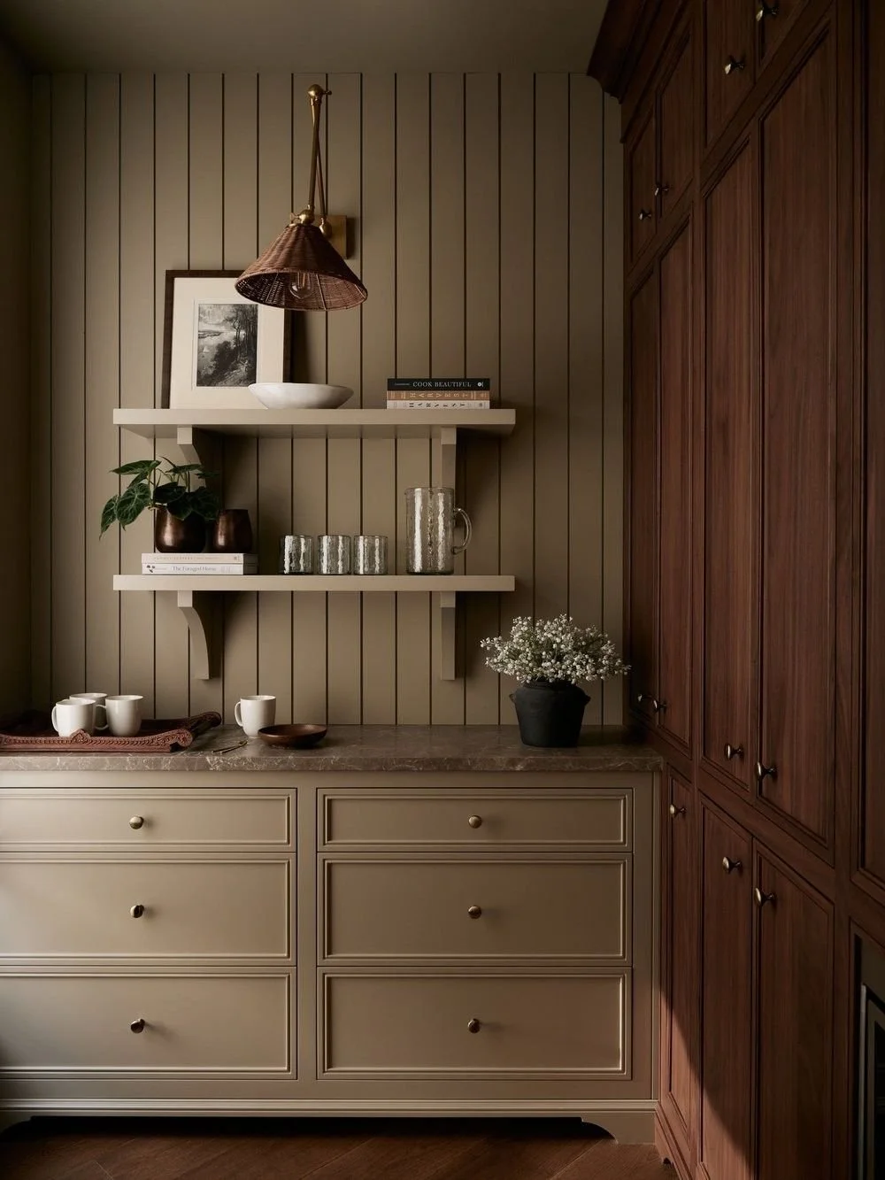
Of course, contrast and pattern can bring life to a space, but there’s something quietly powerful about tonal design. When everything is speaking the same language, the space feels cohesive, enveloping, soft. The key to designing a great color-drenched space and keeping it visually interesting is texture; without it, it has the capacity to fall flat and one dimensional.
This is where the materials I’m naturally drawn to come in: matte, natural, imperfect. Lime-based paints and earth-inspired pigments add depth to the walls. Then come the layers: unglazed clay tile, honed stone, aged wood, unlacquered metals. These materials absorb light instead of bouncing it, which gives the color even more dimension. It feels grounded and lived-in from the start. Layer by layer — walls, textiles, furniture, floors — the atmosphere starts to take shape.
If you want to try it at home, begin with how you want the room to feel. Calm? Energized? Warm? Let that emotion lead the way to the color and then sample it generously — on the walls, the trim, even the ceiling — and live with it for a few days. Watch how it changes with the light. Give yourself time to decide. Does it set the tone you’re intending? Does it evoke the feeling you’re searching for?
> Start with a feeling. Peaceful, cozy, focused, moody — what emotional tone do you want the room to carry?
> Sample it everywhere. Try the color on different surfaces, and at different times of day. Let it settle.
> Layer your materials. Use stone, wood, linen, metal, and ceramic to bring out the richness of the tone.
TRY IT IN YOUR HOME
Photos sourced from Pinterest unless otherwise noted.
Some favorites: A soft green living room with walnut wood accents and oatmeal linen. A powder bath in deep plum from baseboard to crown, paired with aged brass and vintage art. A warm ochre kitchen where the walls, cabinets, and ceiling all speak the same note and then finished with natural stone countertops. A muted blue sitting room with plastered walls, shearling upholstery, and antiqued bronze lighting
The beauty of this approach is that it doesn’t need to shout to be felt. The color does the work — you just have to let it.